
Sep
14
Pro Combat Uniforms and the Like
My last post focused on all the teams that had redesigns of their everyday uniforms this year. Now I’m looking at teams who got special, one-time uniforms, like Nike’s famous (or in some cases infamous) Pro Combat uniforms. Nike started this trend of one-time-wear uniforms, and it’s growing. Adidas did the same for Notre Dame and Michigan, and Under Armour did whatever it is they did to for Maryland. Other teams have some alternate colors of their normal uniforms, but these are the ones that are all new designs.
Let’s start with the Pro Combat uniforms. Compared to some of last year’s, they’re much more tame for the most part (which is a good thing). I don’t ever want to see what Virginia Tech wore again.

Georgia
 The first three sets of Pro Combat uniforms were worn in Week 1 of the season. The most talked-about were probably Georgia’s. They had never had Pro Combat unis before, and they were the most different from their traditional, everyday set. There were lots of comparisons to Power Rangers and super heroes because of their all-red nature. And as much as I hate Georgia, that’s the only huge complaint I have with these. If these had silver pants, I may even like them (gasp!).
I don’t like the red stripe coming down onto the facemask, although I like that they tried. I would have thought it was a good idea if someone had described it to me, but it just doesn’t look that good. And the giant helmet stripe is too big, but I like that it’s bigger than normal. I agree with most everyone that these looked like crap in the game against Boise, but in my opinion that’s mostly due to the red tops and pants. Give these silver pants, shrink the helmet stripe a little, and make the facemask all black, and these would actually be pretty cool.
Boise State
Boise’s Pro Combats are basically a white version of last year’s, and they looked nice. The bronco side of the helmet is cool, but it sucks that it leaves a blank white side.
Oregon
Oregon’s worn some ugly stuff, but these are cool. If that highlighter yellow was a bit less glowing and the shoulder wings were more subtle, less shiny, they’d be awesome. Wonderful use of the black matte helmet.
Michigan State
 The rest of this year’s Pro Combat uniforms were just unveiled and haven’t been worn yet. Nike decided it would be fun to add gold to Michigan State’s school colors. Looking at this in no way makes me think it’s Michigan State. In fact, it makes me think it’s South Florida.
Gold and green aren’t my favorite color combination, and the green logo doesn’t work that well on a gold helmet. But at least they’re staying away from textured gradients this year and keeping things clean.
LSU
 LSU’s are sweet. I love white helmets, and purple and gold is a much better color combination than purple and yellow. Lose the armpit stains and lessen the thickness of the purple collar and these are nearly perfect.
Ohio State
 Yikes. Last year, Ohio State got great Pro Combat uniforms. This year, not so much.
The shoulder stripe is just ugly. And while the jerseys kind of look old-school, the pants have this modern texture in the red stripe, and the helmet is a shiny silver that doesn’t match the dull, dark gray of the uniforms. And they’ve got Georgia’s helmet stripe.
Stanford
 Nike didn’t try out much with the Stanford uniform. They just went monochrome, tried a nifty number font, and for some reason, gave them a black matte helmet. I love black matte helmets, but not when they don’t make sense. And if you are going to use one here, don’t put the cardinal-colored logo on it. It doesn’t look very good. Maybe a cool Cincinnati-style gray.
Army
 With Army, they just kind of did a modern update to the previous uniform. I love the Army stencil number font, though. That’s a nice touch. They look nice, but they’re nothing too special. I love the camo unis they’ve worn before.
Navy
 These look nice for the most part. I love the white helmet and thick, but not Georgia/Ohio State-thick, helmet stripe. But one thing… why the huge drop shadow numbers? And while I love the simple, white helmet, am I the only one that thinks the anchor on the side looks a little like a Madden create-a-team?
That’s all the Pro Combat uniforms. Here’s the one that everyone was talking about after Week 1…
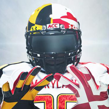
Maryland
 Anyone who read my post about 2011 college football uniform changes knows how I feel about Maryland’s new uniforms. Well the ones that they kept secret until gameday made me hate them more. The tops aren’t thaaaaaat bad, but those helmets… I love the idea of being the “state team” and letting the state flag inspire the uniforms, but don’t just vomit the state flag all over the uniforms. Use it in some trim or on the helmet stripe like before.
Adidas made Notre Dame and Michigan special uniforms for their crazy game last weekend under the new lights at Michigan.
Michigan
 These are sweet. Maybe not as an everyday uniform, but I love them as an alternate. I’ve always wondered why we never saw a football uniform more like a soccer uniform with a big center logo and small number on the front. I like it. And the shoulder stripes are cool.
Notre Dame
 Notre Dame’s are super-old school. Like Michigan State, the green logo on the gold helmet doesn’t entirely work, but I like the retro feel of these for one-time use.
Any other new designs teams are getting for one game?